You walk the sidewalks of Queens or Brooklyn, and there it is: the bold blue‑and‑mustard palette of the Zohran Mamdani campaign. You see it on the storefronts, lamp‑posts, subway entrances. That palette – yellow taxi meets vintage Bollywood poster meets MetroCard primaries – is not incidental. It is the branding backbone of a campaign that seeks to both reflect and reshape New York’s urban visual culture.
The campaign’s designer, Aneesh Bhoopathy, points out that the identity is “anchored in New York iconography and the city’s typographic heritage.” It reclaims the politics of the street, the bodega façade, the gritty local aesthetic, and transposes them into the high‑stakes world of mayoral politics. From the mustard yellow to the deep cobalt, from the serif lettering of “ZOHRAN” in shadow to the hand‑painted feel of signs, the campaign is saying: this is us, New York in colour, shape and community. It refuses the homogenous blue‑navy corporate template of the political class.

That visual identity sets the stage, but the photography around Mamdani is where things get rich:
- It tells a story of roots and belonging (South Asian + immigrant + New Yorker).
- It plays with accessibility and authenticity (“in the street”, “with the people”).
- It holds a mirror up to what politics looks like when done differently.
- It also reveals the vulnerabilities of image: the beard becomes symbol; a flyer becomes a manipulation.
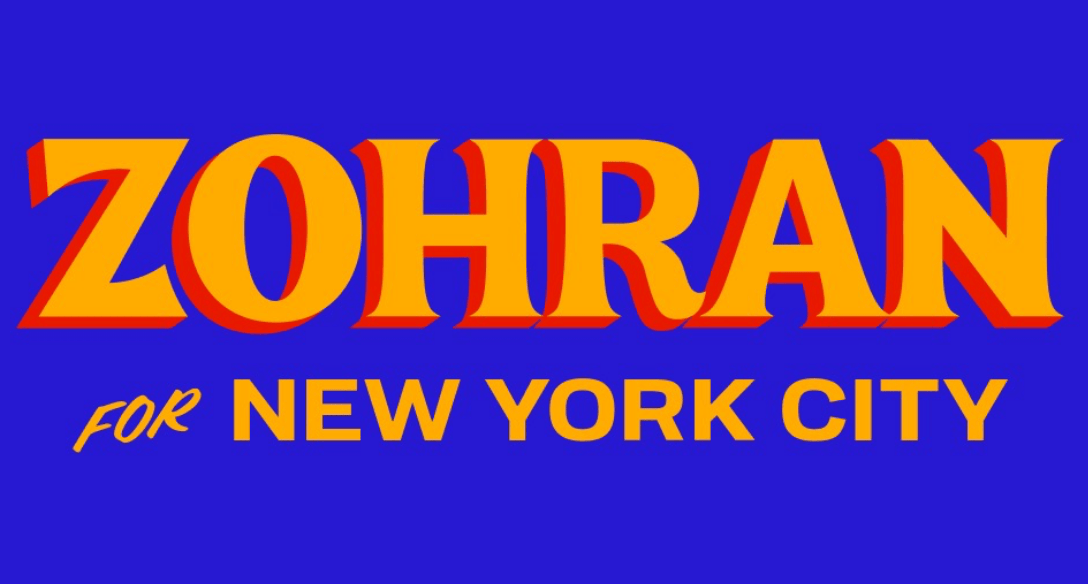
Photo 1 – The Poster Portrait “Bollywood‑Street”

One of the most recognizable visuals is the 2025 poster showing Mamdani in bust‑shot, smiling, on a bright blue background with his name ZOHRAN in large, mustard‑yellow serif letters with a red‑orange drop‑shadow. This image—bold, unapologetic, immediate—signals something new in NYC electoral branding.
Why it matters
- The typography nods to old Bollywood teasers (large serif, shadowed letters) and fuses it with urban street signage.
- The colour combo of blue + yellow + red pops against typical campaign signage; it stops the commuter’s eye.
- By positioning Mamdani front‑and‑centre, it positions his identity (name, face, vision) as brand and candidate in one.
- It normalizes a South Asian‑Muslim face in the visual lexicon of NYC politics, without relegating it to a token “minority candidate” aesthetic.
Theoretical angle
From the lens of Roland Barthes’ punctum notion – the poster lacks a subtle “sting”, but its studium (the general cultural code: politician, poster, campaign) is clear. The punctuation here is in the lettering trick, the colour palette, the knowing wink at genre. The image doesn’t just mark presence; it makes presence.
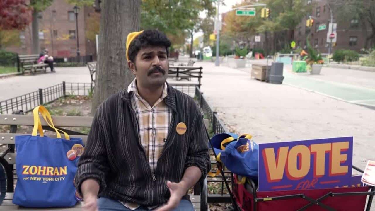
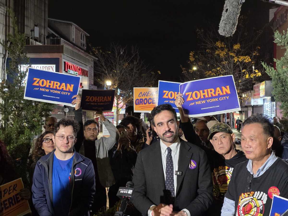
Photo 2 – The Street Scene & Supporters
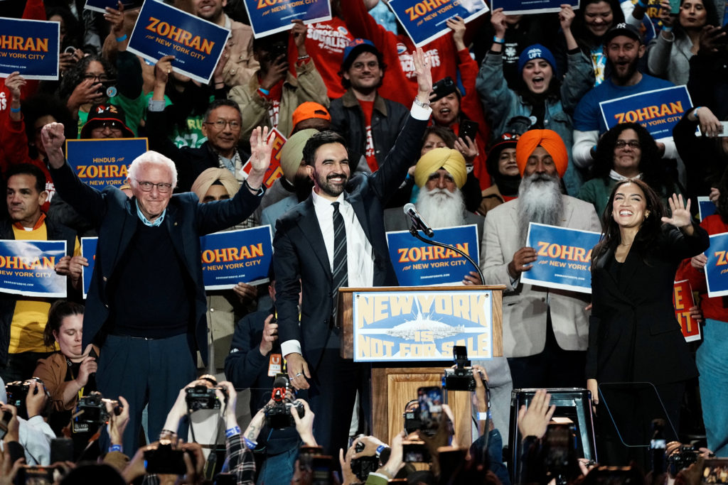
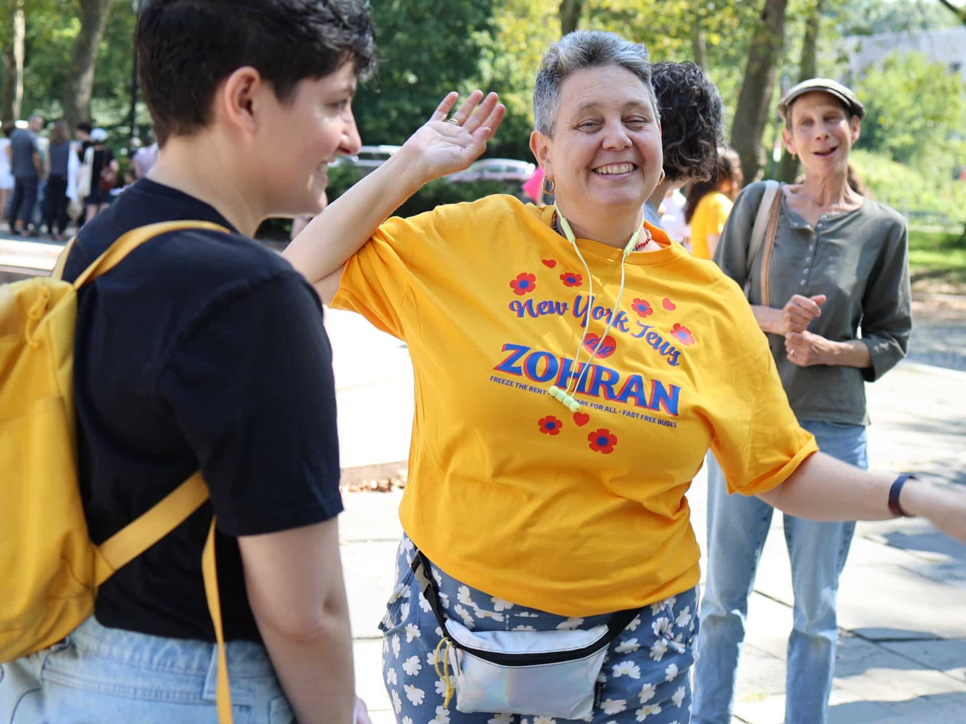
A second type of visual shows Mamdani with his base: young supporters in yellow and blue T‑shirts, logos prominent, arms raised, smiles wide. The candidate here is part of the frame, not isolated above it. This photograph frames the campaign as movement, not monologue.
Why it matters
- Visual repetition: the logo becomes motif—shirts, hand‑held boards, banners. The campaign name spreads like graffiti, a recognisable tag across boroughs.
- Diversity: New York faces of all colours, languages, crew, appear. This isn’t a sanitized “leadership” shot—it’s community in full view.
- The candid, wide‑angle shot speaks to accessibility, reinforcing the message that Mamdani is one of them, not apart.
Theoretical angle
Here, Stuart Hall’ idea of representation comes alive. The image doesn’t just represent Mamdani—it presents a coalition, a demographic, a voice. The act of photographing supporters in brand colours becomes itself a sign of inclusivity and mobilization. The medium is the movement.
Photo 3 – The Controversy: Altered Photo Flyer
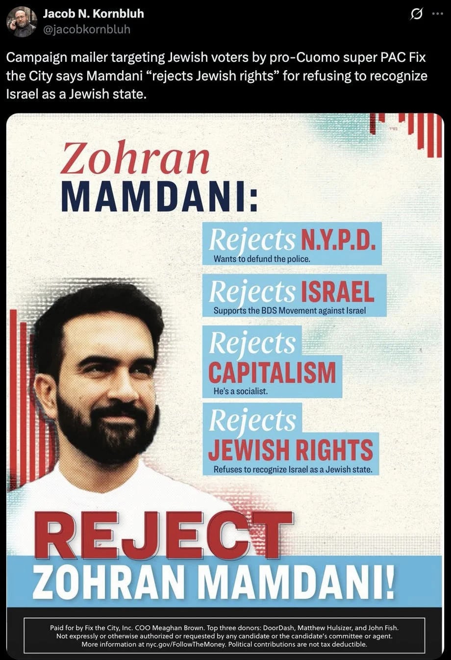
One of the most telling images in Mamdani’s visual story isn’t one his campaign published—it’s one used against him. A super‑PAC backing his rival allegedly released a flyer in which Mamdani’s beard was made darker and longer, his complexion subtly altered. The candidate called it “blatant Islamophobia”. (The Guardian)
Why it matters
- The beard—an ostensibly minor feature—becomes a charged visual signifier of “otherness”.
- Manipulating the photo underscores how image is weaponised in politics: not only what you show, but how you show it.
- The public disclosure of this distortion amplified Mamdani’s narrative: “If they fear me, they’ll change my face”.
Theoretical angle
Here Sontag’s On Photography rings loud: the photograph is never neutral. A manipulated photo constructs a narrative of fear. And Barthes’ punctum is present: the altered beard becomes a pinprick in the viewer’s reading, forcing awareness of manipulation. The fight over the image is a fight over identity.
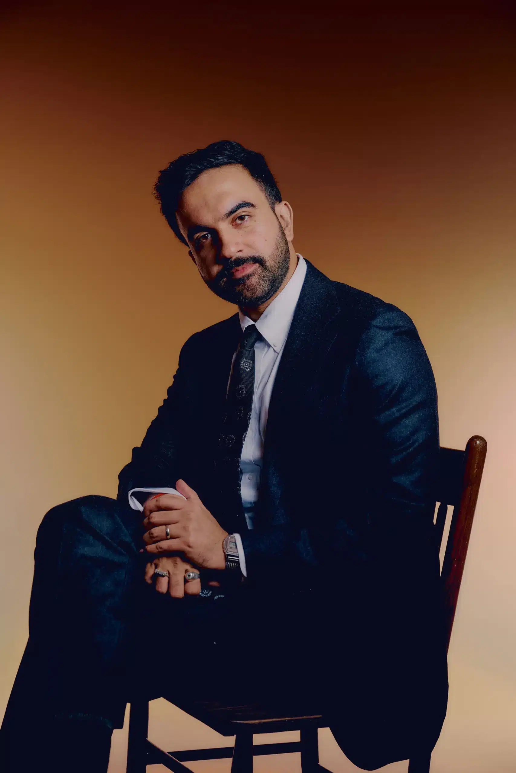
Photo 4 – “In the Streets”: Campaigning Among the People
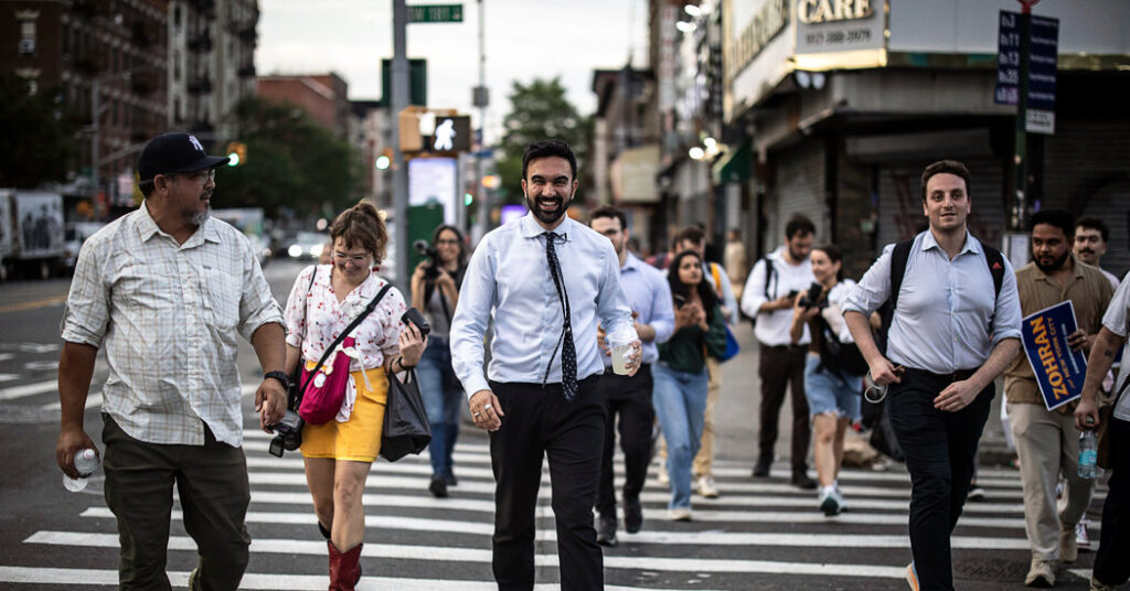
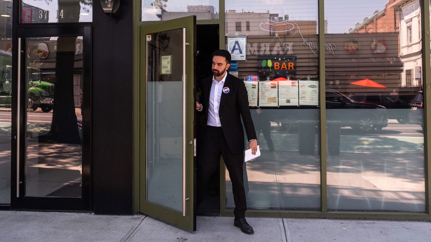
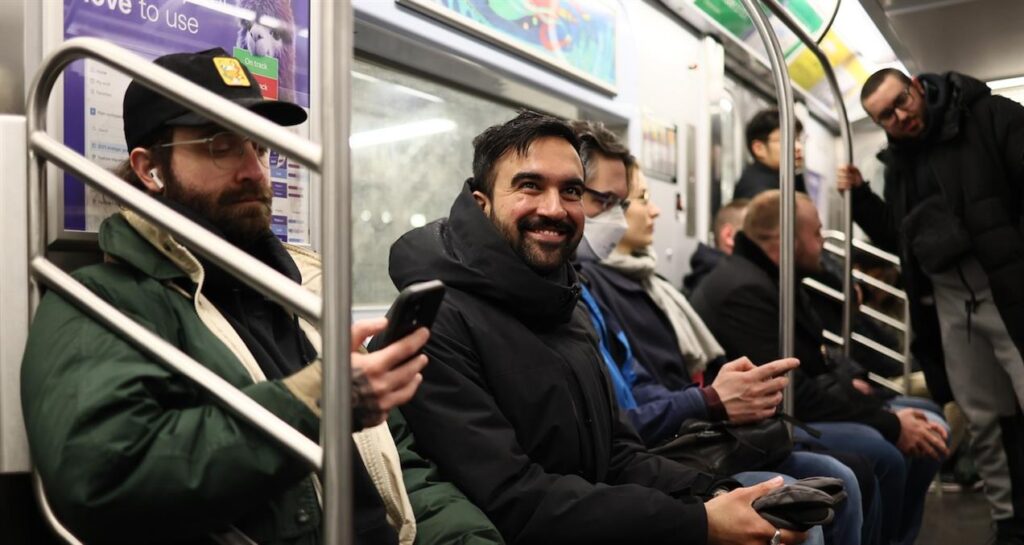
The next image type shows Mamdani walking down the street, talking to residents, glass of water in hand, sneakers visible, casual jacket. Urban scenery frames him—not podiums, not pristine studios.
Why it matters
- It signals authenticity: he’s not behind glass, he’s out there, among the subway entrances, brick facades, day‑to‑day New York.
- The background isn’t staged: it’s noise, people, movement. It tells a story of campagne de terrain.
- The handheld shot aesthetic (or at least it feels like it) evokes immediacy, rawness, connection.
Theoretical angle
This style engages Sontag’s idea that photography mediates reality. The chosen “real” is still curated, but the curation here emphasises process over perfection. It aligns with the campaign’s narrative of being “of the city”, not above it.
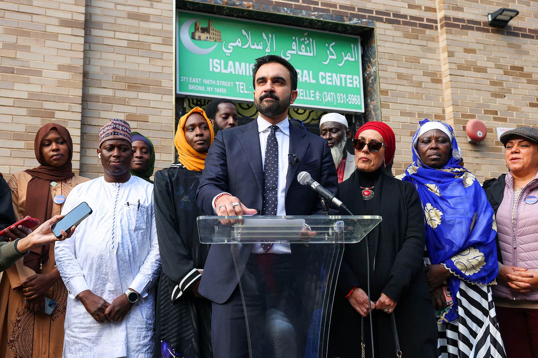
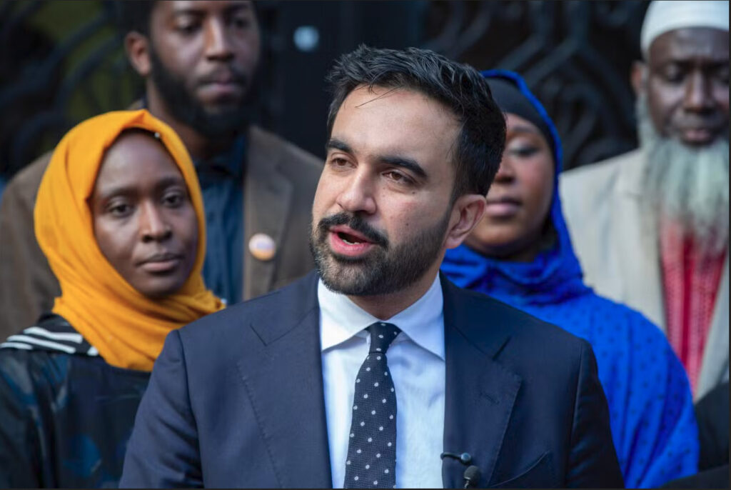
Photo 5 – The Multicultural Handshake
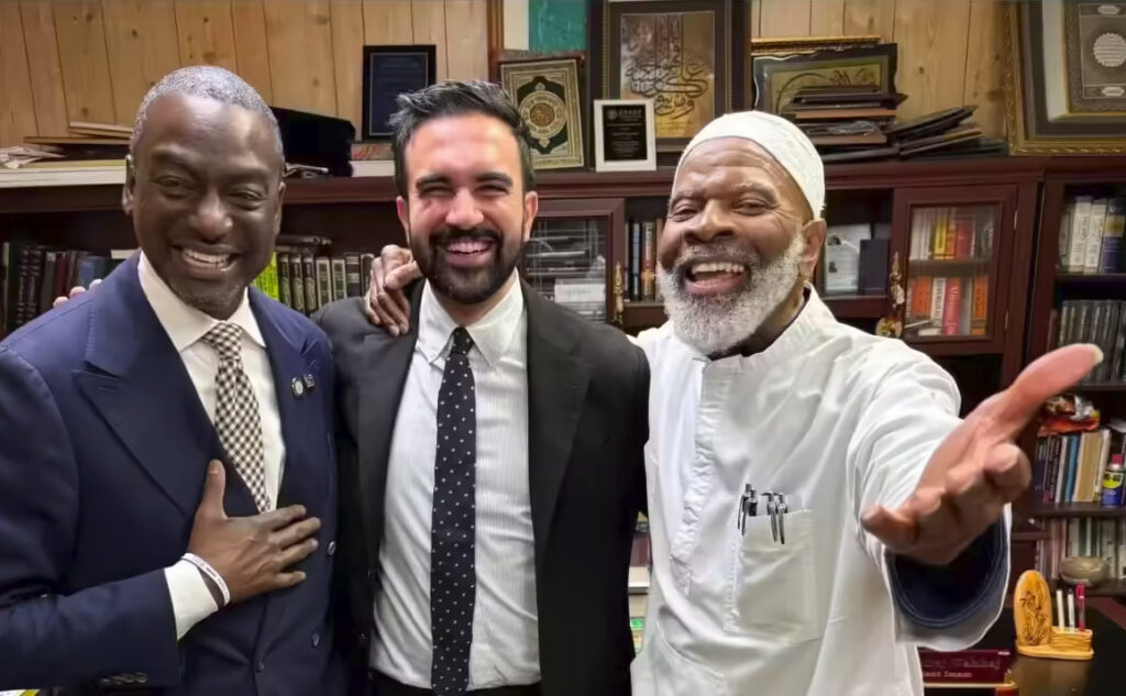
In one striking photo, Mamdani stands with the imam Siraj Wahhaj, outside a mosque in Bedford‑Stuyvesant, Brooklyn. This image garnered attention for being both symbolic and contentious.
Why it matters
- It visually places Mamdani at the intersection of communities: immigrant, Muslim, Black, faith‑based.
- The handshake becomes iconographic: a gesture of connection, respect, coalition.
- The colour palette again matters: the white kufi of the imam, the clean shirt of Mamdani, the brick backdrop—simple, direct, unflashy.
Theoretical angle
From Hall’s perspective, this image is representation in action. It doesn’t just show diversity—it performs it. From Barthes’ viewpoint, the handshake is a punctum—a detail that emotionally resonates and invites meaning beyond the immediate. The image signals: “I belong, we belong, New York belongs”.
Pulling It All Together: What This Aesthetic Does
- It re‑frames who the candidate is: not a typical suit‑and‑tie out‑of‑the‑corridor-of‑power figure, but someone rooted in the city, its colours, its people.
- It re‑frames what politics looks like: bold, playful, street‑visible, culturally referential rather than corporate polished.
- It re‑frames how identity is seen: immigrant, South Asian heritage, Muslim faith – all made visible not as deficit but as dimension.
- It confronts the image war: the altered photo flyer reminds us that in 2025, politics is as much image‑management (and image‑battle) as platform‑management.
Final Thoughts
The aesthetics of Zohran Mamdani’s photography and branding are not accidental. They are a calibrated mix of authenticity, street‑style, cultural homage and visual disruption. In a city saturated by images, this campaign stands out because it looks like the city while promising to change the city.
If you’re reading the posters, the rally photos, the “on‑the‑ground” candids, you’ll see more than a campaign: you’ll see a claim to visibility, to voice, to place. In that sense, the campaign has already done something beyond politics—it’s given us a new visual vocabulary for what progressive leadership in New York could look like.